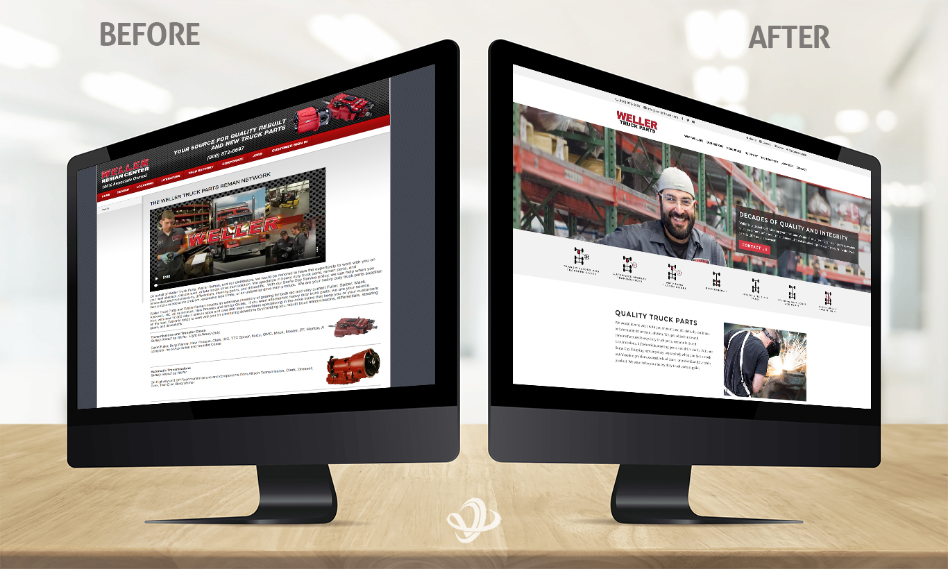
Much like a remanufactured part – where something is disassembled, cleaned, and reassembled with quality inspected components – Weller Truck’s new site isn’t an entirely new creation. While most everything on Weller’s old site was useful, it was nowhere near using the best website search design.
Valorous Circle took Weller Truck’s frame, the literature, technical support, and location information, stripped the rest, and reformatted the layout with one significant improvement that set the tone for the rest of the website.

By changing “Search” to “Inventory,” (and adding plenty of design elements), Weller Truck became open for more business opportunities.
All websites have a search function, even if they’re hiding. A parts distributor must rely on accurate information to successfully deliver the correct component to the right people, and a generic search menu item is too broad of an option to find what you’re seeking.
Many websites created in the early 2000’s never accounted for the use of smartphones, so mobile responsiveness wasn’t a top priority. Due to the demand for heavy-duty parts across the United States, searching for replacements and remanufactured items on the go is a necessity.
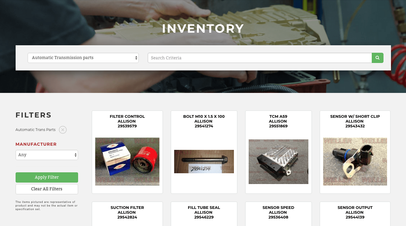
Beyond lists of transmissions, differentials, gearboxes, pumps, driveshafts, and electronics, a noted parts remanufacturer like Weller Truck lacked an inventory showcase for instant searches on any device.
The highlight of Weller Truck’s new site is the interactive inventory page, replete with categories, search criteria, manufacturer type, and other filtration options.

Iconography is essential when dealing with parts and components. Even if you have limited knowledge of the part you need, nearly all Weller Truck products have photo representation beyond a stock image.
Specificity isn’t a barrier to great design. Separating yourself away from your competition, even if you were competing against your old way of thinking, is an ultimately worthwhile process.


