Why Your Text Shouldn’t Span the Entire Page
Hold onto your hats, folks! We’re about to plunge into the fascinating world of website layout and design, specifically focusing on one critical aspect: why your text shouldn’t span the entire page. If you’re imagining some curious creature spreading its wings across the digital landscape from left to right, you’re not entirely off. But it turns out, this creature, when it manifests as blocks of text on your website, can be more of a menace than a marvel. Why, you ask? Strap in and let’s get started.
Key Takeaways
- Avoid Wide Blocks of Text: Wide blocks of text can be difficult to read, scan, and can lead to eye fatigue. They can also decrease comprehension of your content.
- Narrower Blocks Are Better: Narrower blocks of text are easier to read, scan, and can improve comprehension. They are also more visually appealing.
- Use Readable Font and Size: Choose a font that is easy to read and a size that does not strain the eyes of your users.
- White Space Is Essential: Utilize white space to break up the text, making the page easier on the eyes and increasing readability.
- Include Headings and Subheadings: These elements provide structure to your text, aiding the reader in understanding the content hierarchy and allowing for easy navigation through the material.
- Break Up Text with Visuals: Images and videos can add interest, break up large chunks of text, and provide a visual rest for the reader.
- Consistency in Design: Maintain a consistent design throughout your webpage. This enhances the overall user experience, making it easier for your visitors to navigate and understand the content.

Understanding The Issue: Wide Blocks of Text
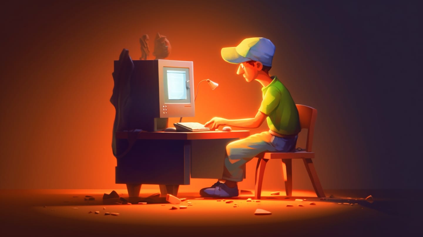
Imagine you’re looking at a book, say War and Peace, for instance, with each page filled from edge to edge with text. There’s no margin, no space to rest your eyes. The text runs all the way to the edges, as if in a desperate bid to escape. Sounds exhausting, doesn’t it? This is what a webpage looks like when content spans its entire width.
Studies like the Nielsen Norman Group’s show that wide blocks of text are harder to read and scan, likening it to trying to win a staring contest with a painting. The group also found that narrower blocks of text have more appeal – like a tidy, well-groomed bonsai tree, easy on the eyes and mind.
Eye Fatigue and Decreased Comprehension: The Downside of Too Much Text
A University of Utah study found similar results, stating wide blocks of text could lead to eye fatigue and decreased comprehension. Imagine being lost in a sea of words and having to navigate to the shore of comprehension. Not quite the leisurely reading experience we’re aiming for, is it?
Conversely, the study found that narrower blocks of text can lead to increased comprehension and decreased eye fatigue. Think about it as creating comfortable pathways for your readers’ eyes to follow.
Breaking Up Is Not Hard to Do: Designing for Readability
So, you ask, how do we avoid turning our website into a barren wasteland of daunting text blocks? The answer lies in breaking up the content into smaller, more manageable chunks. Here are some tips we recommend:
- Use a readable font size: A size that doesn’t require the reader to squint or zoom in is advisable. Trust us, nobody wants to feel like they’re trying to read the fine print of a dodgy contract.
- Choose an easy-to-read font: Fonts are like the voices of your website. Choose one that speaks clearly, not one that sounds like it’s gargling marbles.
- Set an optimal line height: This gives each line of text a comfy space to exist in, without feeling squished. It’s like having your own room in a bustling family home.
- White space is your friend: It breaks up the text and gives the reader a chance to breathe. Think of it as the silence between musical notes, making the melody more enjoyable.
- Headings and subheadings are key: They help organize the text and provide guideposts for the reader’s journey. It’s like having signboards on a road trip.
- Images and videos help: They break up the text, add interest, and provide a visual break. Remember, a picture is worth a thousand words, and a video, well, that’s an entire novel.
- Consistent design matters: A consistent design throughout the page makes it easier to navigate. It’s like having a reliable tour guide through the website jungle.
Frequently Asked Questions
Q1: Why should I avoid using wide blocks of text on my website?
A1: Wide blocks of text can be overwhelming for readers. Studies have shown that they can lead to eye fatigue and decrease comprehension. On the other hand, narrower blocks of text are more visually appealing and easier to read and scan.
Q2: Does the font size and type matter when laying out text on my web page?
A2: Absolutely! Choosing a font that’s easy to read and a size that doesn’t strain your users’ eyes plays a vital role in the readability of your content. It’s like making sure your website’s voice is clear, audible, and not mumbling.
Q3: How does white space enhance readability?
A3: White space is like the pause in a conversation – it gives the reader’s eyes a moment to rest and process information. It breaks up text, making your page easier to read and increasing overall comprehension.
Q4: How can images and videos improve my web page layout?
A4: Images and videos are a great way to break up large chunks of text and provide a visual rest for the reader. They add interest, can reinforce the points made in your text, and make the overall reading experience more enjoyable.
Q5: What does a consistent design mean and why is it important?
A5: A consistent design means maintaining the same look and feel throughout your webpage. It includes consistent use of colors, fonts, and layout styles. This enhances the overall user experience, making it easier for your visitors to navigate and understand your content. Consistency builds familiarity, which in turn builds user trust.
It’s a Wrap!
There you have it – a comprehensive look at why letting text span the entire width of a webpage is a mistake you’d best avoid. As we’ve discovered, there’s a lot more to it than just aesthetics
. It’s about readability, user experience, and helping your audience get the information they need in the most accessible way possible.
While we can’t promise that following these tips will make your website as delightful as a basket of puppies, we can guarantee it’ll become a better reading experience for your users. So go forth, and may your text never again span the entire page. After all, good design is about recognizing when to give your words the space they deserve. Remember, even words need their personal space.