Learning how to choose the right font for your website isn’t all that difficult, but overlooking it is a big mistake. The font may not make or break a website, but it can accentuate and highlight what you want viewers to find most important.
Before you start getting into the nitty-gritty of which font should display on your site, here are a few guidelines.
Match Your Branding
Creating a logo sets the tone for the rest of your site. Color scheme, sizing, artistry, and font all go hand in hand when creating a logo. By matching the font from your logo, you’re taking the first big step in laying out the rest of your site.
The Rule of Three
Branding can only control so much, but it’s also important not to go overboard. There’s a big difference between knowing how to choose the right font and adding fonts that you like. What is appealing to you as a person may not be the best choice for your business?
By selecting up to three different fonts, you can control which narrative matches your branding, conveys the right message, and commands a call to action.
Are You Modern or Traditional?
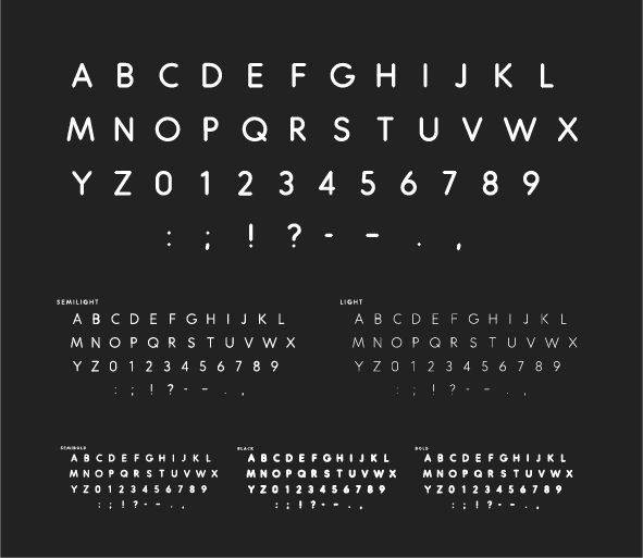
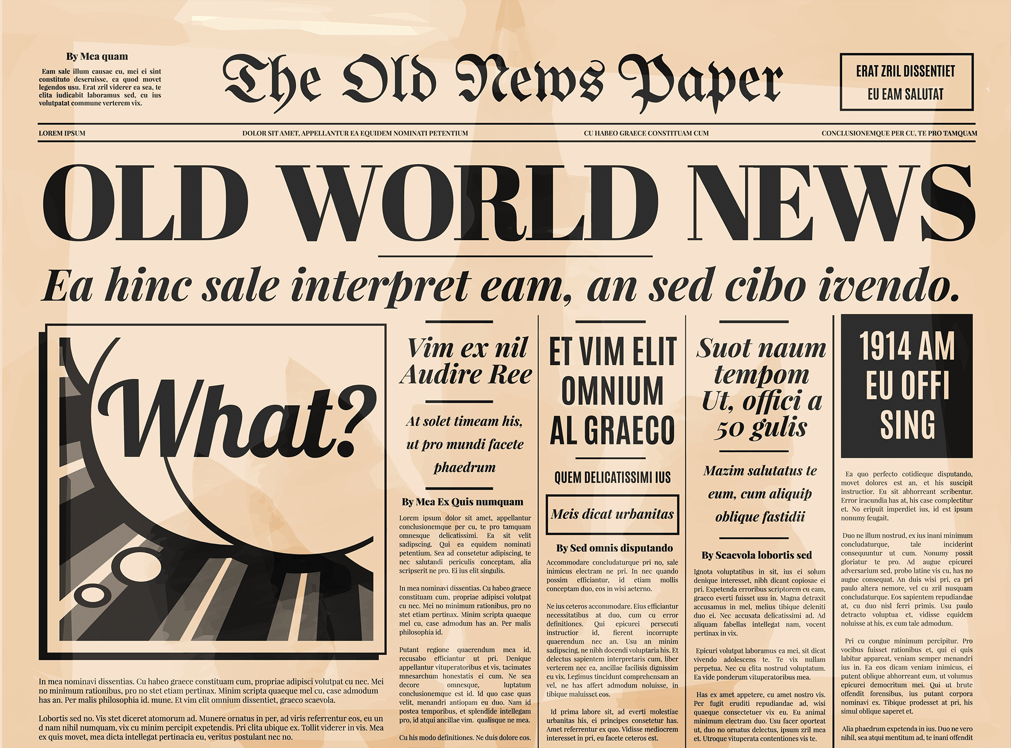
Times New Roman hit print in 1932. Arial in 1982. Times is a serif font you’ll often see in newspapers while sans serif fonts like Arial and Helvetica are what you’ll generally see online.
Older markets gravitate toward serif fonts because of their traditionalism and perceived legitimacy. Sans serif, while not any less legitimate, are the typefaces you see in this blog among most other modern media.
Know Your Audience’s Age
Piggybacking off of your serif choice, if your older audience prefers a more traditional font, it’s best to combine it with other fonts that are easier to read. Kerning and tracking are a means of letter spacing that aid in design and readability.
If your letters are too close together or far apart, you may need to make a change that displays bigger and bolder text to attract an older audience. Similarly, script font is harder for younger people (iGen, Millennials) to read because cursive writing is becoming less popular in modern schooling.

Attractive vs. Creative
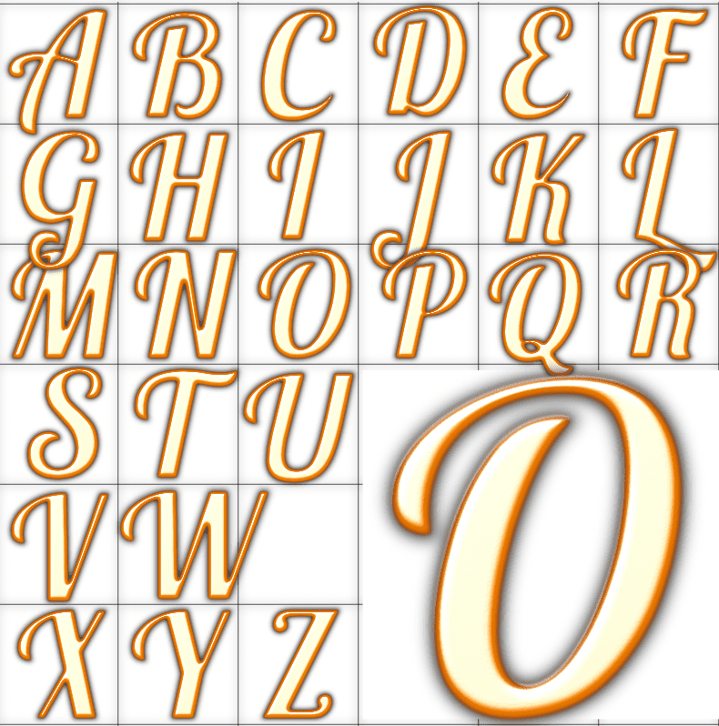
No, not beautiful in the looks department, but appealing to the average customer. Your Gothic font may look fantastic with your color scheme and layout, but both are often hard to read consistently. The golden letters are an example of Lobster font, which, while stylish, is not meant for every word on your design project or website.
Try to keep headlines and body copy separate. Your headline should stand out, yes, but the majority of your content should be easily digestible to the user. In addition, the more ornate your font, the less legible it is for mobile readers.