Creating a homepage is trickier than it looks. It’s a balancing act that requires an astute eye for detail, targeted messaging to reach your most important audience, and it must be easy to navigate.
Without years of experience, it’s possible to get maybe one or two of these aspects to work. But not all three. That’s where experience is a must, and where our website redesign services typically come into play. Before you start the heavy sighs and sinking shoulders, stop, take a deep breath, and read the next sentence.
Your website may not need a complete overhaul.
We can tell you’re feeling better already. As we mentioned earlier, a well-functioning homepage features three aspects:
- Design Detail
- Targeted Messaging
- Ease of Use
- … and you have to achieve this in 5 seconds
Trust us, it’s not as daunting as it sounds, but it isn’t for the novice either. Even the best designers, developers, and clients fall into ruts sometimes. When nothing is working, it’s easy to throw a lot of images, words salads, and video at the wall trying to make something stick.
Just don’t hit the publish button.
Fusion-IT needed help to pull back from too many ideas crowding its busy homepage.


Over-eagerness will doom any web design faster than the client can read your menu options. If your homepage resembles a spam ad at the bottom of a local news article, it’s time to dial down the graphics and reassess your overall goal.
A good webpage will tell its viewers where to go and what to expect. A great webpage will turn average viewers into qualified leads by the time they cycle through the full page. A bad webpage will turn off your customers with poor design tactics.
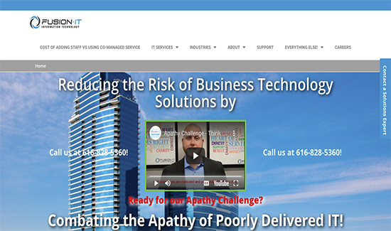
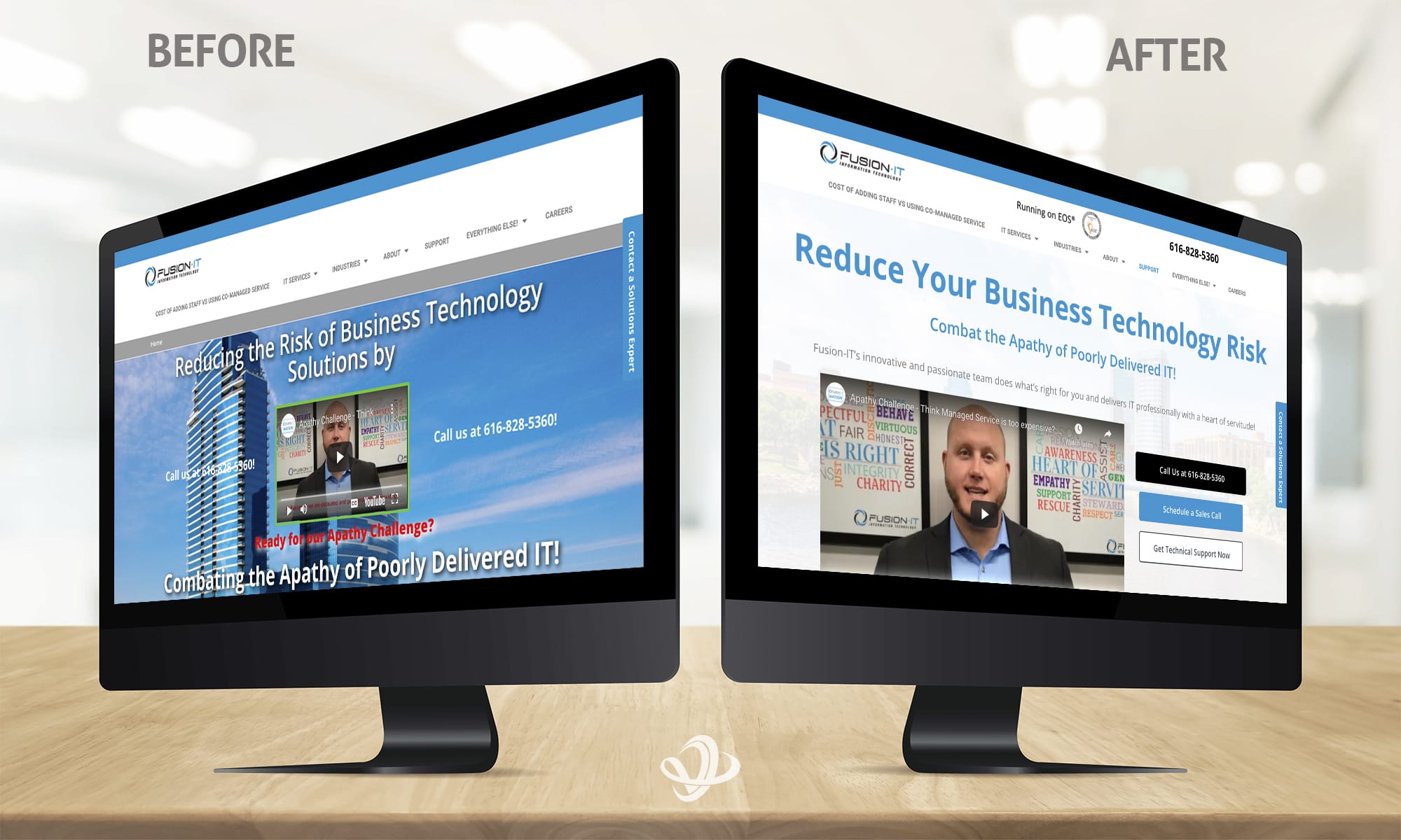
Fusion-IT’s former homepage featured a few faux pas.
- Background image is the same opacity as what’s on top. Regardless of what’s in the image or how related to your business it is, your background image needs to stay in the back. Here, subtle reinforcement is better than overwhelming imagery.
- Light font color on light background images. Contrast is vital to understanding what’s important and what’s secondary. Don’t confuse the customer. Tell them what’s important and make it clear.
- Too many colors spoil the branding. Fusion-IT’s main color scheme is black, blue, and white. Yes, the video has some extra colors, but it’s an entity within the page, not a design element. The green shadow box and red question below are unnecessary choices and only work to distract — not inform — the viewer.
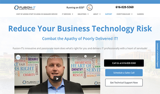
What does the new design improve upon?
The Grand Rapids skyline is still in the background. The headline is largely the same. The phone number didn’t change.
Layout. Color. Navigation. Calls to action. All of Valorous Circle’s subtle differences aid the decision-making process of new page viewers.
Knowing what to change and improve upon only comes with experience and knowledge. Our website redesign services aren’t creating website from scratch. Our developers are refining your message and creating a more coherent process for your customers to establish a lasting connection.


