UPDATE: Brigade Fire underwent a Valorous Circle redesign in Spring 2021. While many of the features remained the same, a new homepage streamlines the company’s hiring process and highlights service calls to action.
The primary message in the last design will always apply to their business, but it is no longer on the homepage. During this redesign, we opted for an established feel, positioning Brigade Fire as generational leaders in fire safety and protection.
For a more detailed look at those changes, see our portfolio page: Brigade Fire.
Specializing in fire protection, suppression, and inspection, Brigade Fire is a leader in preventing fire-born disasters. The key to designing a good website is finding a balance between what is visually appealing and what your customers need to know.
Being an industry leader and licensed to operate in nine states won’t matter, however, when your website cannot accurately convey your primary message. Fire Sprinklers Save Lives.
A statement that is so important it’s printed on the backs of work shirts. Although if you visited Brigade’s site before fall 2016, you’d be struggling to find it published anywhere, let alone what Brigade offers.
Websites without crystal clear messaging suffer. The same can be said for sites with distracting or mismatched visual elements.
The old Brigade site was not responsive, meaning you couldn’t view it on your smartphone without finger zooming. Responsiveness is key to the success of businesses in the smartphone age. As technology advances, so must your online presence.
Pair responsiveness with updated imagery and you have something relevant and cross-generational. Before Valorous Circle, Brigade Fire used a solid black background with flames growing above the backdrop.
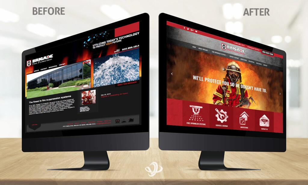
Black, as a color choice, is not welcoming. Brands use black to invoke power, fear, or other serious subject matters. Add flames, and you have a distracting element leading eyes away from any calls to action, of which there are few and difficult to recognize.
Alternatively, Valorous Circle’s red and gray color palette, while not naturally bright colors, work in tandem to convey a message of rugged professionalism, which is how we often see firefighters. Placing a firefighter front and center is reassuring, as positions of power are comforting in times of crisis.
Valorous Circle’s design emphasizes expert knowledge that guides visitors toward specific calls to action–services, inspections, and employment opportunities.
Designing a good website is harder than you may think. It takes an expert team to integrate your most important messaging. For instance, the missing mantra Fire Sprinklers Save Lives now makes many comebacks without losing its powerful meaning.
Brigade Fire’s most important service now has a reinvigorated meaning.